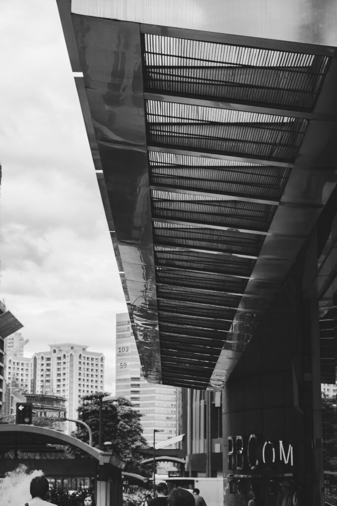
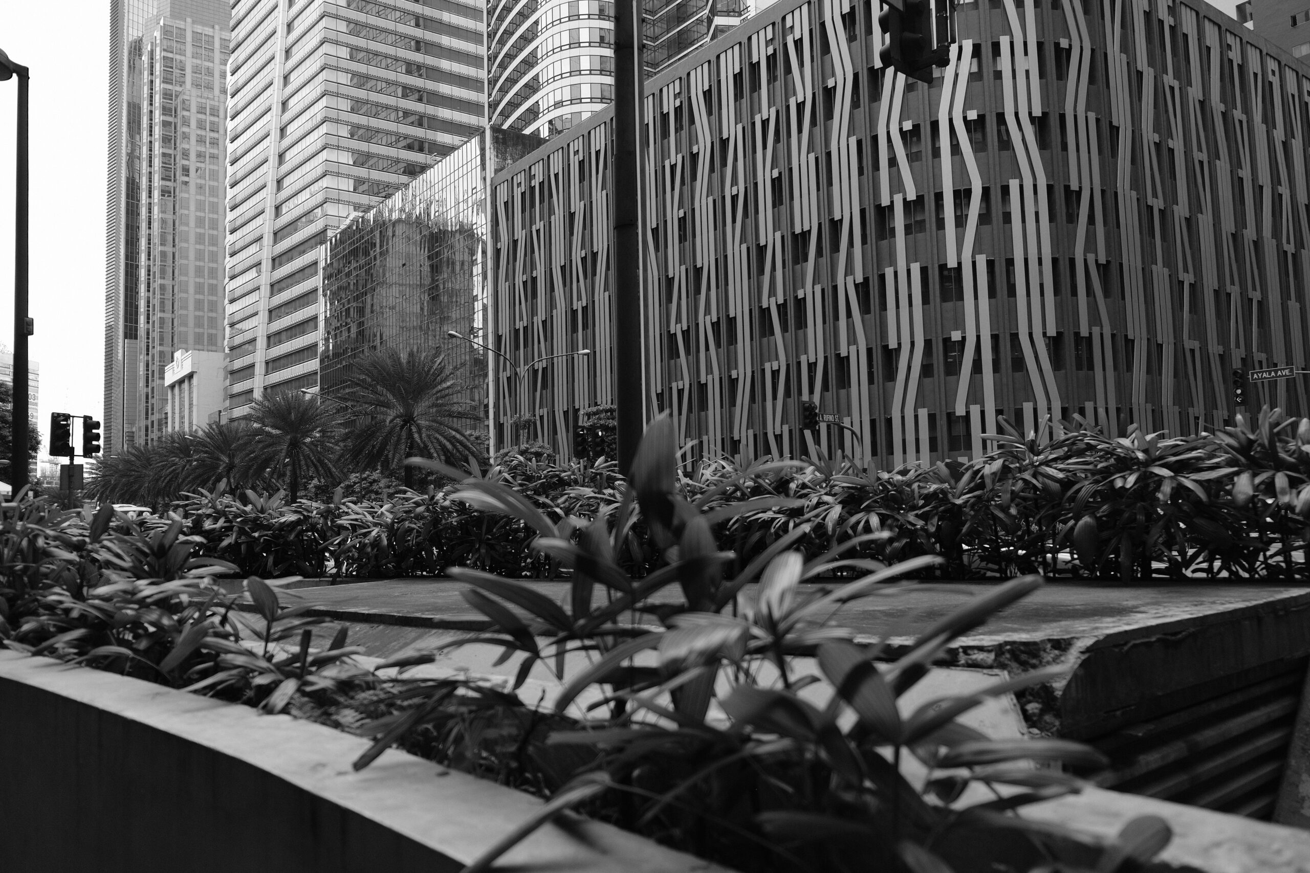
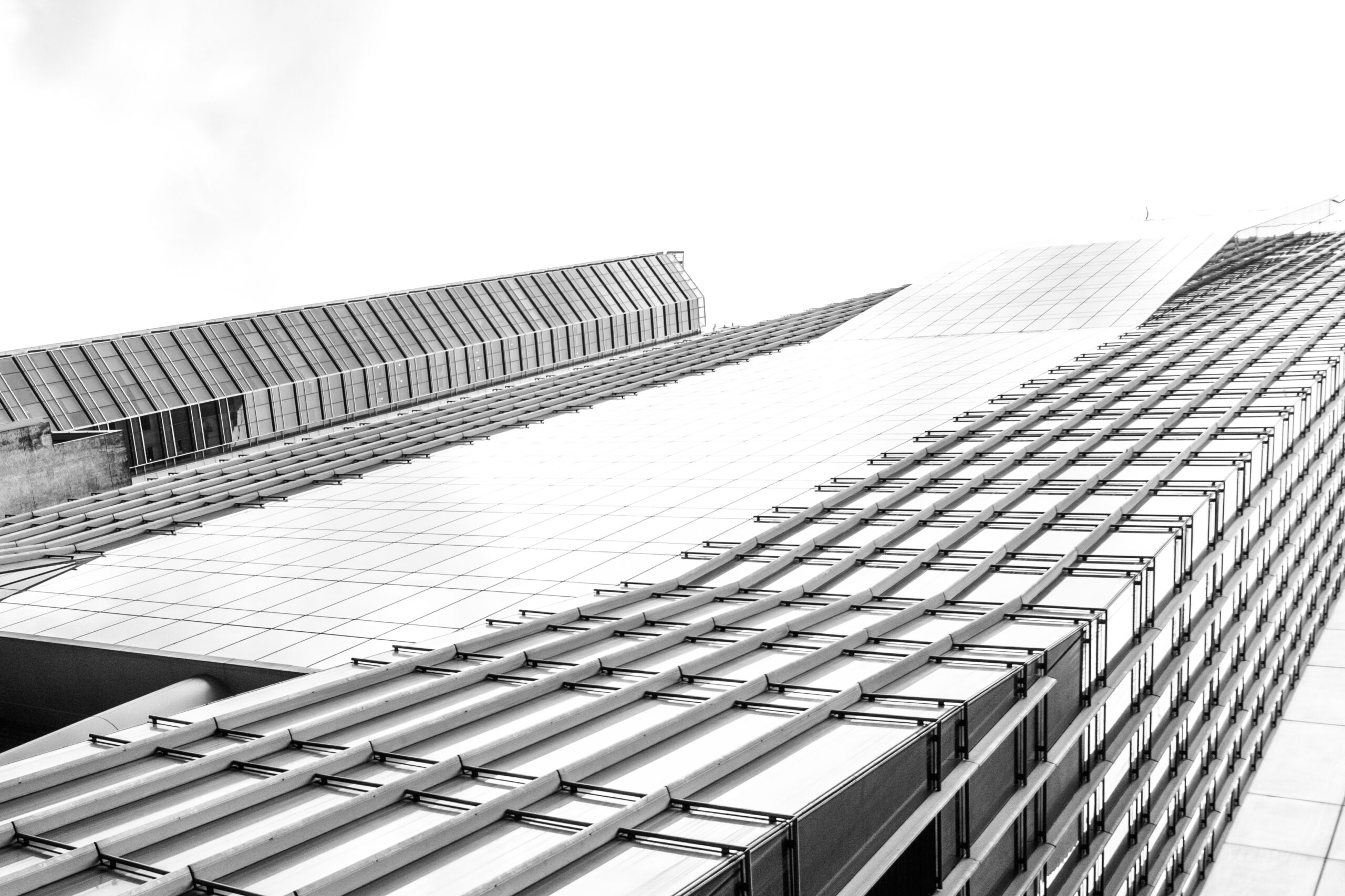
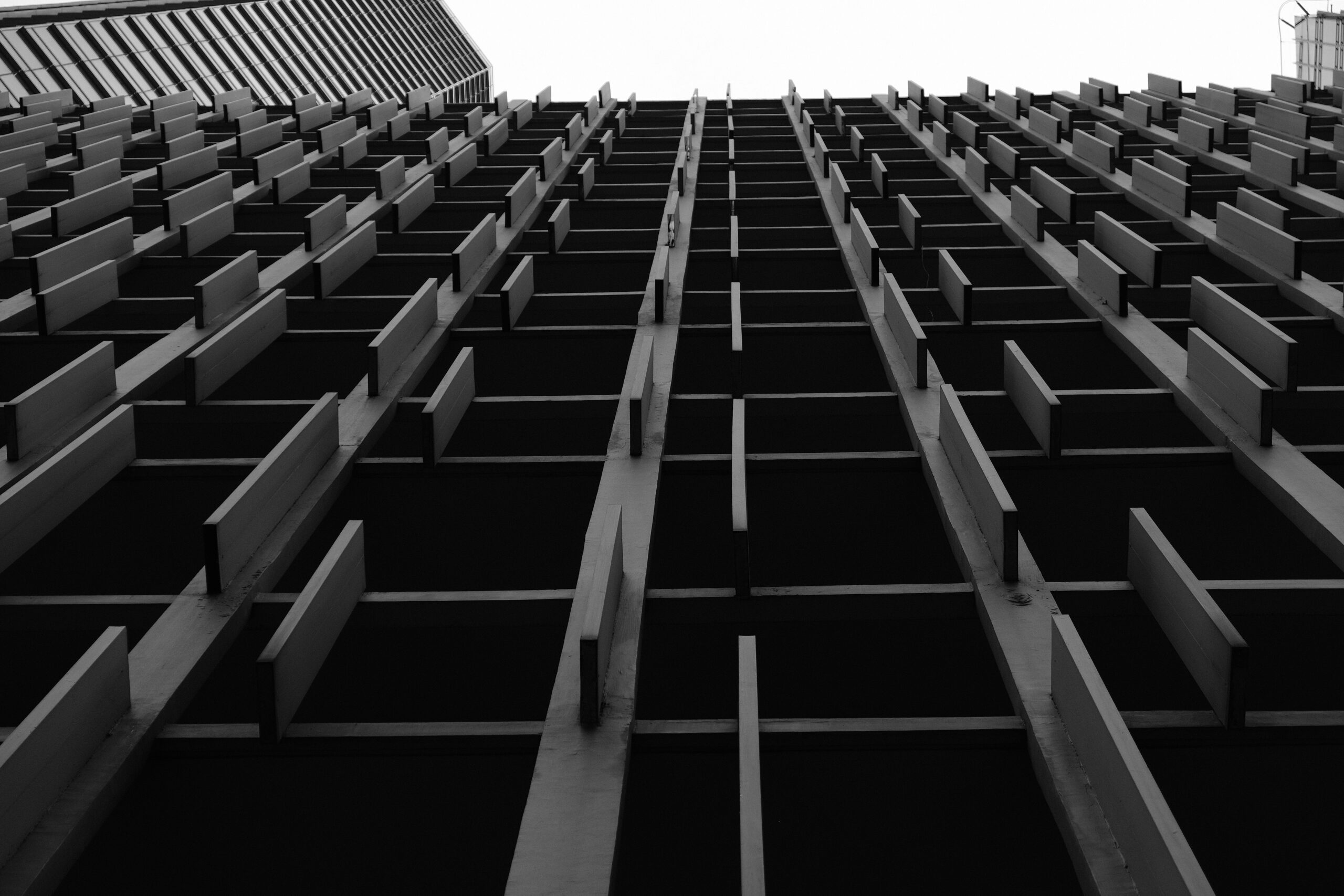
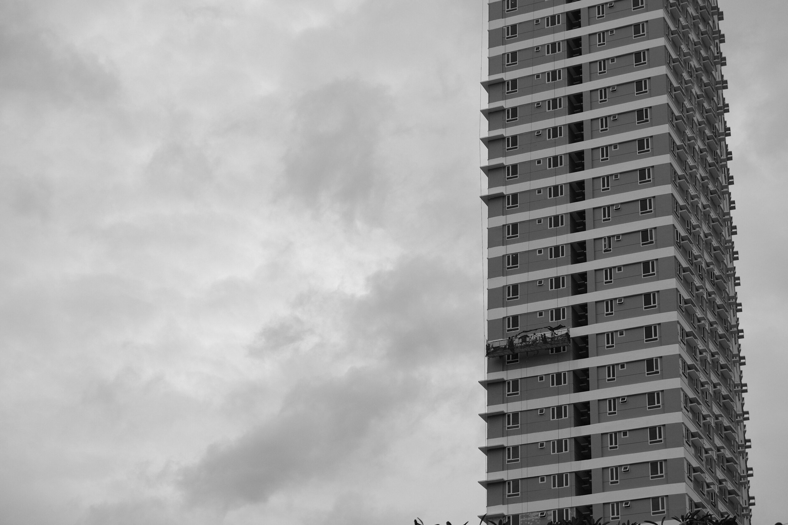
These photographs capture a strong cross section of Makati’s architectural identity, with PBCom Tower anchoring the series through its projecting steel canopy and disciplined glass façade. The canopy introduces a pedestrian scale beneath an otherwise vertical corporate tower, expressing late 1990s financial district modernism defined by steel, curtain wall systems, and restrained detailing. Nearby office buildings feature repetitive vertical fins and deep façade articulation, responding to Manila’s tropical climate by controlling solar heat gain while creating rhythm and shadow across the elevation. Other towers show more contemporary interpretations, with irregular vertical elements and patterned façades that soften massing and add movement to the skyline. The residential high rise, marked by repetitive balcony bands and visible maintenance gondolas, reflects Makati’s dense vertical living environment where compact floor plates and layered horizontal striping reduce visual weight. Together, these buildings demonstrate how Manila’s urban architecture balances corporate modernism, climate responsive design, and high density development within a compact financial district.
Architectural Themes Observed
-
Glass and steel corporate modernism in Makati CBD
-
Strong vertical rhythm through fins and façade articulation
-
Climate responsive shading devices for tropical conditions
-
Mixed use high density vertical development
-
Repetitive balcony bands defining residential typology
-
Pedestrian scale introduced through canopies and podium levels
-
Monochrome composition emphasizing structure, rhythm, and texture
Your black and white treatment further highlights order, geometry, and contrast, allowing façade patterns and urban density to take visual priority over color.
